Alice's Adventures in Wonderland
Lewis Carroll's Alice's Adventures in Wonderland (1982). Barry Moser (Illustrator) and Selwyn H. Goodacre (editor)
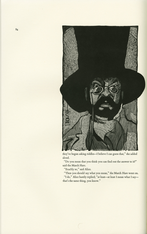
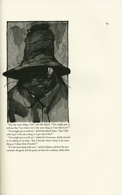
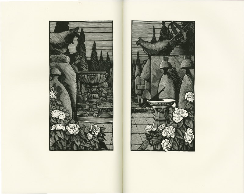
Barry Moser’s visual interpretation of Alice’s Adventures in Wonderland, published in 1982, illustrates the tale of Alice with woodcuts that subtly reflect the influence of 1980s punk. Woodcuts use only one color of ink and therefore contrast light and dark to a greater extent than other art media. Moser uses this medium to display for readers Alice’s topsy-turvy world as a bizarre and even sinister place. We see the story through the eyes of Alice, represented here as a dark-haired girl modeled on Moser’s own daughter instead of the traditionally pure-looking, blonde-haired, bright-smiled Alice.
Punk is characterized by a consistent rejection of the mainstream. And while punk is often associated with a distinct musical style, fashion designers like Vivienne Westwood crossed mediums and helped shape a uniquely punk fashion movement by pushing against traditionally feminine aesthetics with dark colors and oversized pieces.
Just as Westwood rejects conventional images of femininity, so too does Moser reject the now customary portrayal of Alice, suggesting that Moser also adheres to punk ideals. Additionally, the overall darkness of the woodcut print, the Mad Hatter’s clothing, and his slightly sadistic expression mirror the dramatic and deviant style of punk culture. Punk defied social norms and Alice’s edgier depiction in this edition echoes this subculture. Employing woodcuts, Moser generates an alternative imagining of Carroll’s story that, like punk, discards lighthearted conceptions to make room for a more eerie interpretation.
Sadie Cohen and Jacqueline Kenny
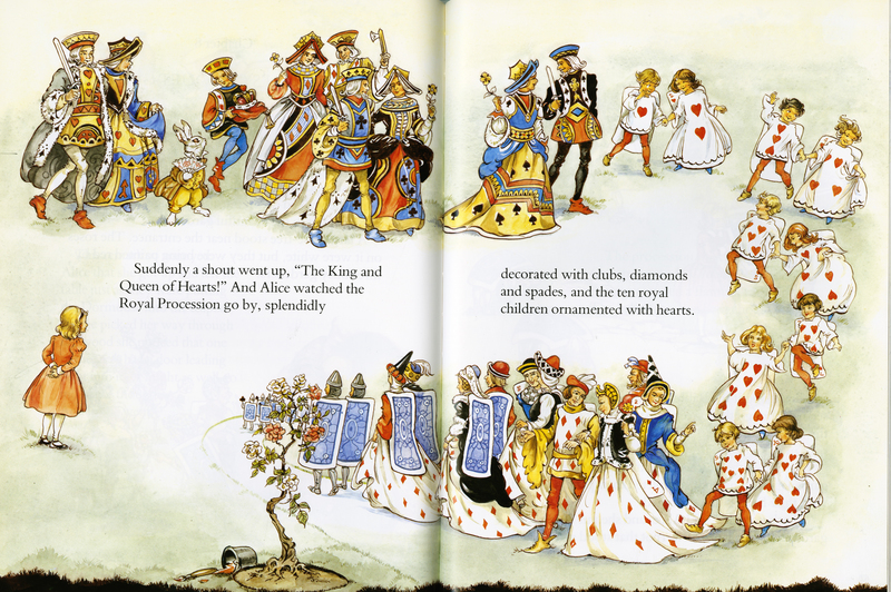
Lewis Carroll's Alice in Wonderland (2004). Jane Carruth (adapter). Rene Cloke (illustrator)
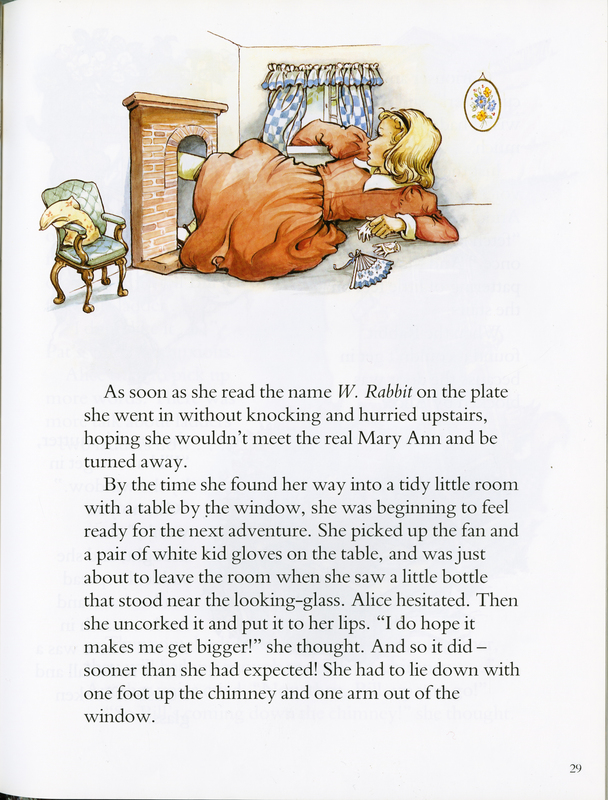
In Jane Carruth’s version of Alice in Wonderland, illustrator Rene Cloke provides Lewis Carroll’s story with mundane illustrations that notably contrast with the nonsensical narrative. Carroll is widely recognized for creating a mad, distorted world that seems to promote the opposite of socialization. The transmission of this subversive world into children’s books may encourage young readers to question social norms and become “curiouser and curiouser.” However, Carruth’s version incorporates naturalistic drawings that pull readers away from the mad world. In the more familiar illustrations by John Tenniel, Alice’s unusual relative size is boldly emphasized. By contrast, Cloke’s Wonderland is adjusted to normalize Alice; this prevents her from ever appearing out of place. When she changes size through drinking and eating, there is little in the art to suggest that her size is out of the ordinary, and the colors used for Alice suggest no contrast from the muted colors of the foreign land.
Neutralizing such a nonsensical tale seems to contradict Carroll’s original intent. This could express a more conventional value of proper socialization. Carruth and Cloke appear to want young readers to learn the story of Alice without truly experiencing the weirdness of it; this minimizes the aspects of the text that encourage children to be curious about the world around them, and instead shapes children to behave in a manner that is more acceptable to society. The long text blocks and chapter book format imply that this book is targeting a more advanced reading audience, and the loss of imagination in the illustrations suggests a maturing audience beginning to conform to social norms.
Sarah Warschun and Hannah Markby
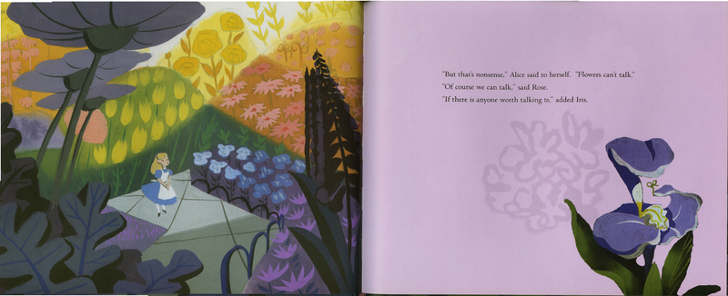
Walt Disney's Alice in Wonderland (2008). Jon Scieszka (adapter). Mary Blair (illustrator)
Jon Scieszka’s 2008 edition of Alice in Wonderland draws its inspiration and images heavily from the 1951 Walt Disney animated movie by the same name. The pictures illustrating the text come straight from the Disney archives of notable animator Mary Blair. The Disney production was based on a combination of Lewis Carroll’s books, Alice’s Adventures in Wonderland and Through the Looking Glass. In this edition, many lines are direct quotes from both Lewis Carroll’s and Disney’s versions. The pages displayed here exemplify this, showcasing Blair’s whimsical mid-century artistic style, a style that emphasizes the concept of nonsense.
Scieszka’s retelling substantially alters and abridges the film and the original books. Both Carroll’s and Disney’s versions allude to Isaac Watts’ poem "Against Idleness and Mischief." In each version, however, the poem is changed from “how doth the little busy bee” to “how doth the little crocodile,” replacing the original text with incorrect verses. This allusion was removed from Scieszka’s version, a clear example of the changing times, since children no longer memorize Watts’ poems during their early education as they once did.
Demonstrated in the pages chosen for display, Scieszka’s Alice mirrors the theme of nonsense present throughout Carroll’s original text and the adaptations that followed. This continuity across versions of the narrative shows that even with all of the changes applied to the original text, this idea remains important, as it represents the child’s wandering and growing imagination.
Heather Gaynor and Emma Koski
Alice in Wonderland: The Mad Hatter's Tea Party (2016). Joe Rhatigan and Charles Nurnberg (authors). Eric Puybaret (illustrator)
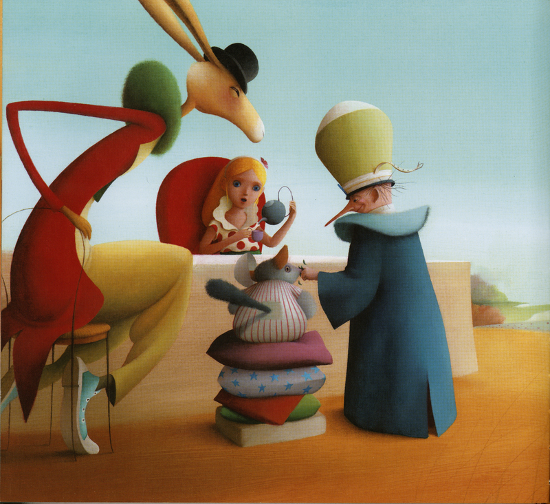
This 2016 version of Lewis Carroll’s Alice’s Adventures in Wonderland is inspired by the original text’s Mad Tea Party chapter, which features the March Hare and the Mad Hatter. In this edition, aspects of both characters have been modernized for the child reader. In the original, the Mad Hatter misuses words and turns the “normal” into the extraordinary. He is fantastical, and his tea party displays his personal eccentricities and Wonderland’s magic. The March Hare in Carroll’s text is both bizarre and exciting. He flirts with the line between the human and the animal: even though he is a rabbit, he speaks, wears a shirt, tells time, and sits upright. He thus eludes easy categorization.
These original characters have been adapted for present day accessibility. Puybaret simplifies the Mad Hatter’s inclination toward wordplay through the conspicuous word “YUM” and the Hatter’s “strange giggles” about the concept of nothingness. The language of the original Tea Party is abstract, complex, and filled with puns, but this version offers the same ideas with brevity and childlike visuals.
Likewise, in the original work, a talking hare at a tea party is enough to attract a child’s attention. However, a talking hare at a tea party wearing blue Converse, an indication of contemporary human culture, captures the mind of a curious child in 2018, while remaining true to the creature’s original double-persona. This modernization of characters allows Alice’s Adventures in Wonderland to live on, even as the world continues to change.
Heather Colley and Lily Dilorenzo
Peter Pan

