Imagery Upfront
Printers and printed books compete for the attention of readers. They seek ways to stand out, to liven up words and draw in eyes. Imagery is one tool printers use to entice prospective buyers. Historically, imagery on or near the title page came in many forms: printer’s marks, author’s portraits, frontispieces, and illustrations.
Pictorial title pages have the potential to connect users to the book and its makers: the authors, printers, correctors, booksellers, etc. In this way, they facilitate a "meeting" between people often separated by place and time. Images invite readers to dive further into the world that has been placed into their hands. They authenticate, authorize, or have us anticipate the text that follows. What is more, they shape a reader's experience with the book. Imagery upfront thus frames and enhances a printed text.
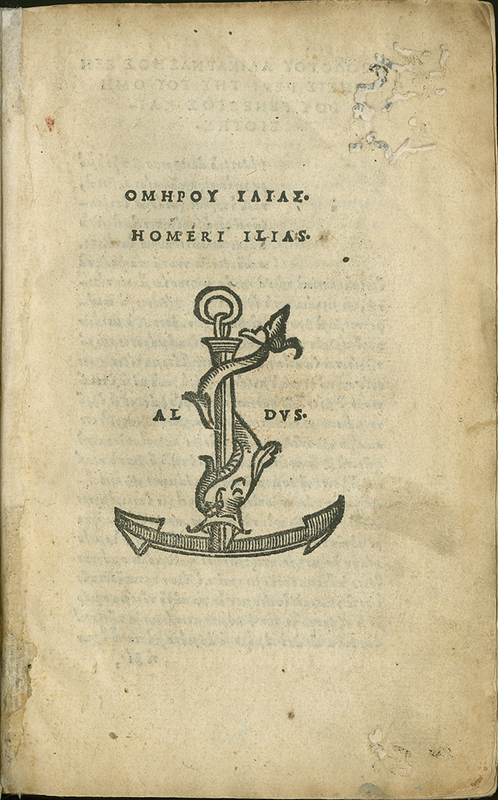
With striking simplicity, this page introduces what the slim volume contains. It renders the author’s name, Homer, and his epic, The Iliad, in two languages, Greek (written in Latin letters) and Latin, line by line, followed by the printer’s first name, Aldus, separated by an emblem. The sparse textual elements on this page appear in a font that Aldus Manutius perfected, Antiqua (Roman), whose capital letters are in the style of ancient inscriptions.
One of the most celebrated publishing houses in the history of books, the Aldine Press specialized among other things in first-rate editions of ancient texts in marketable pocket-size formats. According to the age’s foremost intellect, Erasmus of Rotterdam, a collaborator of Aldus, the ancient motto "Make haste slowly" (festina lente) with the printer’s mark—combining an anchor as a sign of stability and a dolphin as a symbol of speed—emblematizes the hallmark of his prints. While other printers rushed to flood the markets with mediocre products, Aldus Manutius outdid his rivals with editions of superb quality. Our title page gives the reader a foretaste of the print’s stark but elegant excellence.
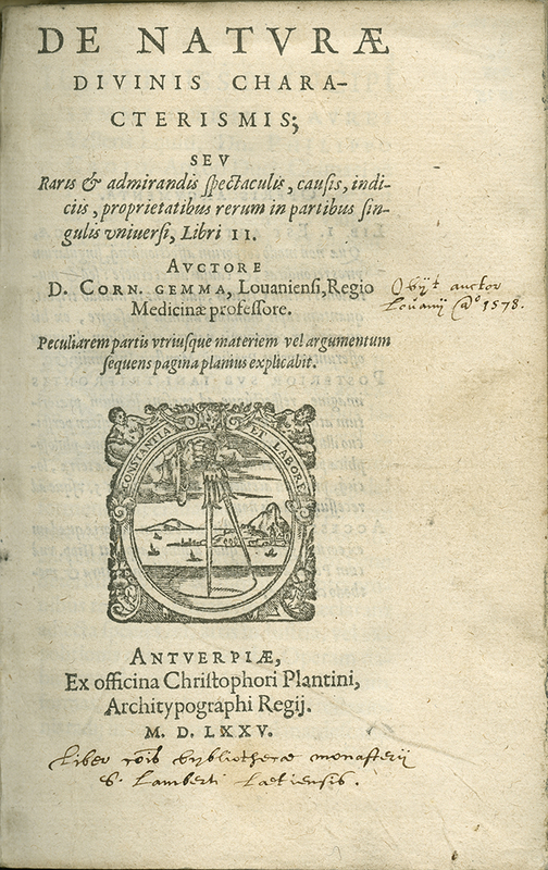
This title page features a mixture of printed and handwritten text. Information about the book appears in a variety of fonts; at the top, in larger letters, is the volume's main title, followed by the subtitle in a smaller, italic font. One handwritten note is scribbled in the right hand margin, next to the author's name. Another appears at the bottom of the page, beneath the imprint. In the middle of the page is a rectangular printer’s emblem. In it, a hand reaches out of the sky, using a compass to draw on the land below. In the background, small boats float on the water and two angular mountains rise up in the distance. The border around the scene bears the printer’s motto: "CONSTANTIA ET LABORE."
Books change hands. With people and places prominently named, the title page is also where many book owners left and leave their marks. The notes in different hands seen here therefore reveal details about this book’s life. On the Divine Characteristics of Nature was a work by a professor at University of Leuven or Louvain (now Belgium) known for his writings on astronomy, including his observations on the supernova of 1572.
The verso professes the book to be "a gift of Phillip Gemma, the author’s son, [on] October 3, 1585." Seemingly the name of the recipient was once written out, but it has since been crossed out, probably by a later owner. In addition, the title page holds two inscriptions in different hands and inks. One, at the bottom, states that the book was once part of the monastic library of St. Lambert (probably Lagny in France). The second, on the right, is a biographical note, stating correctly when Gemma died and where, Louvain 1578. These notes testify to the book’s circulation. Several users valued the book for the way it connected them to the author, and they signaled that connection upfront.
Christopher Plantin in Antwerp ran the most revered printshop of his time. His printer’s mark or emblem with a compass in the process of drawing and the motto, "Work and Constancy," expresses the work ethic behind the vast output from his many presses.
Compare this page with the previous example, Aldus Manutius' 1524 title page for The Illiad.
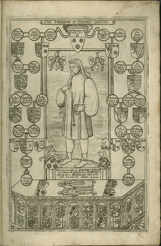
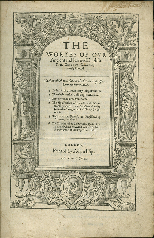
These two highly decorated pages both bear the name of the text’s author, Geoffrey Chaucer (spelled "Geffrey" here). On the right is the volume’s title page, which presents standard information about the book and its publication, as well as a list of additions that have been made to improve on the previous edition. These include "1. In the life of Chaucer many things inserted." The text is surrounded by an elaborate woodcut architectural border on which various allegorical figures are perched. On the bottom left, a cherub sits with his hand resting on an hourglass. To the right, in the middle of the page, a female figure clad in armor holds a sword and a set of scales. The page on left depicts, as the text at the top tells us, "The Progenie of Geffrey Chaucer."
This book’s front matter includes a portrait of the poet; the title page follows. Author’s portraits allow readers to see the person behind the text they are viewing. Here, the purpose of the portrait is to center Chaucer within his lineage. The frontispiece places Chaucer in an elaborate family tree, surrounded by coats of arms of his relatives. The page is rich with heraldry, yet the focal point is Chaucer himself. At his feet lie Thomas and Matilda, Chaucer’s son and daughter-in-law. The depiction of their tomb is notable because Thomas continued his father’s legacy of royal service. This frontispiece celebrates Chaucer’s acclaimed status as an author while also emphasizing Chaucer’s connections to the English monarchy. In addition, it may have served as an armchair pilgrimage to the poet’s recently reconfigured tomb in Westminster Abbey.
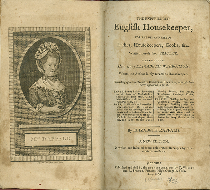
A middle-aged woman in 18th-century dress appears in the center of the left-hand page. Her hair is styled in a tall up-do and covered by a hat secured with a ribbon beneath her chin. Her left arm is bent at the elbow with her empty hand open in front of her body. Surrounding the portrait is brick design and a ledge beneath the woman’s image displays her name: "MRS. RAFFALD." On the right, the title page tells us this is "A NEW EDITION." Beneath the title is a dedication to the "Hon. Lady ELIZABETH WARBURTON, Whom the Author lately served as Housekeeper."
It is as if we can meet her, the woman entrepreneur and author, whose portrait faces the title page with detailed information about the contents of her cookbook, “written purely from practice.” First published in 1769, this engagingly written manual of more than 800 recipes saw over thirty editions until the early nineteenth century. Raffald is not the first woman whose likeness competes with male authors’ portraits upfront. Some volumes by the successful English playwright-poet Aphra Behn contained a portrait and predated hers by a century.
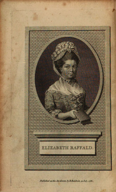
This page is very similar to the one shown above, but with several differences. It contains all of the same basic elements: a portrait of the author, a brick surround, and a placard with the author’s name. Clearly we are looking at a portrait of the same woman, but here her outstretched left hand contains a closed book and she is referred to by her full name.
Tellingly, the first edition that paired Raffald’s book title with an image of her looking at us appeared in 1782, after her death. The original line engraving by Patrick John McMorland is different, however. In our 1806 "new" and enlarged edition, her hand is notably empty. In the original image seen here, she handed the viewer her book, and the label underneath spells out her full name—"Elizabeth Raffald" rather than "Mrs. Raffald." These details exemplify the challenges women authors faced in publishing.
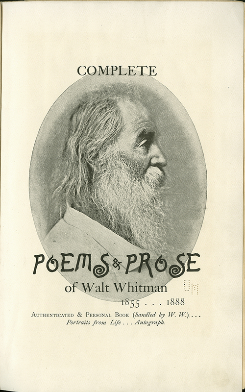
This title page features an oval-shaped black-and-white photograph of the author in profile, his age apparent from his long white, wispy beard and lined face. Superimposed over the bottom of the image is the book’s title, rendered in bold black letters and an eccentric font with swirly "S"s. Off-centered beneath the title and author’s name are printed the dates "1855 … 1888."
Few poets have curated their printed self like Walt Whitman. A devotee of democracy, male-male love, and modern media, he pioneered the use of photography on the title page, as in this edition: an anthology as a summation of his life as a poet. While portraits upfront often serve to render the writer in a timeless, if not monumental, frame, Whitman here is brought alive as we encounter him in several guises and ages throughout the book.
The title page on display features an original, idiosyncratic font that meshes with his aged likeness in profile, from the very time of this edition. Notably, no publisher is named; each copy was signed; and the repeated use of ellipses further suggests that we get to meet this poet directly. The different types of paper used enhance the sensory, if not bodily, quality of this thoroughly designed book, allowing us to interact with a bookish Whitman as with an actual person.
Compare this page with Restif de la Bretonne's Les Nuits De Paris in "Censure & Camouflage."
Experiments & Standards
Censure & Camouflage