Beginnings
Title pages are a standard feature in printed books today. This is why they are easy to overlook. Those who leaf through an item’s initial pages encounter standard information here: title and subtitle, the author’s name, and, at the bottom of the page, the name of the publishing house with the place or places where its seat lies.
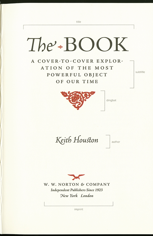
This title page features all of the essential elements one would expect. Each component is accompanied by a slim bracket and labeled– i.e. "title," "author," and "imprint" –in a modern arial font. The stark black of the text is contrasted by the bright red used for several small decorative elements, including a triangular-shaped dingbat of twisting vines beneath the subtitle and the seagull logo above the publisher’s name.
What distinguishes this particular example is its compelling design. The page’s fonts, ornamental flourishes, two colors, and lavish spaces call the reader’s attention to the book as a material object, which is what Houston’s study investigates. This is further highlighted by the explicit use of printers’ terminology (imprint, dingbat, etc.). Tellingly, however, this book on The Book says little about the title page itself; the index doesn’t list this term as an entry.
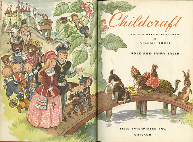
The opening pages of this book depict a whimsical scene in which a company of fairytale characters descend from a castle on a hill in the background, past a giant beanstalk, and across a wooden bridge. Familiar faces among the group include a family of bears, the three little pigs, and a tortoise and hare. On the right, the title of the volume, “Childcraft,” is printed at the top of the page in an elegant italic font and orange ink. Smaller black text informs the reader that this is volume three of fourteen.
When a reader picks up a book, the world outside the book and the world in the text meet. The title page of this illustrated anthology, if not encyclopedia, for children invites us to step into the book. Its colorful images with their many details spark curiosity. Recognizable fairytale figures and animals move across the page. Two characters, Jack and a princess, look out of the page at their audience. On the right, the bridge invokes the threshold between the real and what this book aims to tell us. Just as this procession of living beings must traverse the creek, so too readers are asked to cross a threshold to enter. By turning the page and starting to read we will thus be traveling into the book.
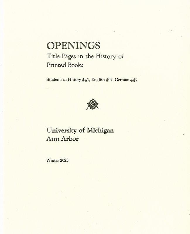
Unlike the previous examples, the one-of-kind page stands alone and is not bound into a book. It bears the title of this exhibit: "OPENINGS: Title Pages in the History of Printed Books." In a smaller font, its authors are listed as the students of History 441, English 407 and German 449. Centered in the middle of the page is a small printer's emblem of a right-angle ruler and compass. Text at the bottom of the page attests to the location where it was produced, "University of Michigan Ann Arbor," and the semester when this exhibit will be on display, "Winter 2023."
The students who researched and wrote this exhibit for a University of Michigan class printed this title page at the Book Arts Studio at the Art and Engineering Library. The class, "The Book in History" taught by Helmut Puff in Fall 2022, was part of the History Lab series. Learning to print a page in one class session is difficult. Title pages are especially difficult. We made some mistakes.
Experiments & Standards