Experiments & Standards
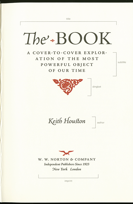
Before the advent of the printing press, books did not feature title pages with the names of authors or the makers of the book. Such pages with their identifiable and legally relevant information emerged only when printers started to mass-produce books.
As a commodity, printed materials need to be stored. Bindings initially were commissioned by buyers and were not a standard feature of books produced in printshops; otherwise, titles could have been displayed on the cover. Instead, printers protected their products with a dust wrapping and titled their print runs.
Early printers experimented with designing books. The first examples of title pages date to the late fifteenth century, two generations after Johannes Gutenberg’s technique of printing with moveable type took off in Europe. At first, it was simply one innovation among many as printing technology rapidly spread. Even the printer of one of the first title pages, Erhard Ratdolt, subsequently printed books without it. By the early sixteenth century, the title page had come to be a standard feature and included all or some of the information we typically associate with the page today.
The page on the left contains a block of text in English, although the shape of the letters and spelling of the words may not be familiar to modern readers. Partway down, the ink appears a bit faded or smudged, attesting to the book’s age. At the top of the page on the right are the last two lines of the text and at the bottom is a colophon in bright red ink.
Manuscripts and early prints had no title pages. To inform the reader, texts from this period often featured so-called colophons at the end; colophon derives from the Greek for summit. These brief statements provide some select information on the book, its making, and its maker or makers.
After the colophon’s formulaic beginning, "Here ends," what follows is the title by which this chronicle was known, Brut or Brutus, the mythical son of Aeneas of Troy, and the genre, chronicle; the unknown authors are referred to as "clerks." This term can be translated as "official recordkeepers," "scribes," and "scholars." Finally, the colophon mentions the contents, royal deeds ("acts"), dating from Brut’s mythical conquest of England onward.
Our manuscript testifies to the great popularity of this mythical-historical narrative among growing numbers of readers in fifteenth-century England, especially the gentry and the nobility. Unlike with print, however, every manuscript is unique. No other text but the Bible is as well documented in manuscript form as this one. Not accidentally, this popular medieval chronicle was printed by the first London-based printer, William Caxton, in 1480.
Can you tell what this passage in red ink says? Take your time to make out the words:
Here endithe a book callid Brute of the Croniculis of
Englond made & compilid by notabill clerkis of
al the actis of all ye Kyngis that evir was in this
londe sithend Brute first conquerid it.
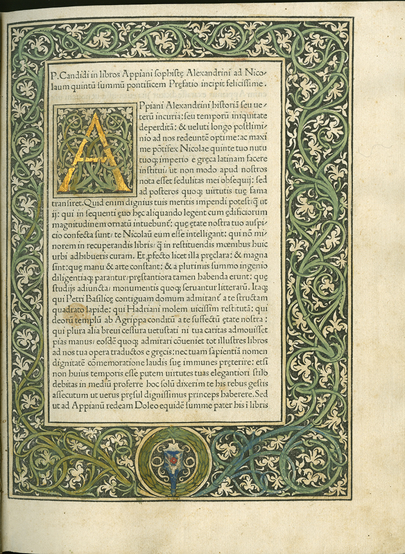
History of Rome's beautifully designed first page features a central block of Latin text highlighted on all sides by a thick woodcut border of garlands made up of twisting green vines and white foliage. The main body of the text begins with a large golden historiated initial letter "A" in the midst of more serpentine green vines set against a black background. It is the second leaf of the first quire after an unprinted sheet (left blank to protect the text block from dust). This book was published in the years before title pages became a norm.
The masterfully executed page is the work of Erhard Ratdolt from Augsburg, Germany. He migrated to Venice, one of the largest cities in Europe at the time, where he collaborated with other German-born printers. This is the first edition of the History of Rome by Appian of Alexandria, originally composed in Greek in the second century CE and translated into Latin by a humanist scholar, Petrus Candidus Decembrius (d. 1477). In the words of the late nineteenth-century historian of print Gilbert Redgrave: "[T]here are few printed books of any age which can be compared with the Appian of 1477, with its splendid black ink, its vellum-like paper, and the finished excellence of its typography," including its spacing. Compare this page with the 1902 William Morris below.
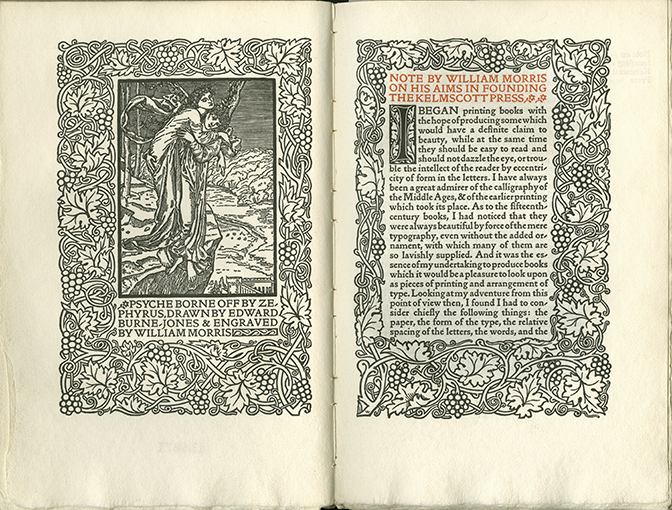
The page on the left depicts a scene from classical mythology where, as explained in the text beneath it, the beautiful Psyche is rescued from the edge of a cliff by the winged figure of Zephyrus, god of the west wind. The text on both pages is surrounded on all sides by an intricate black and white border of twisting vines, large leaves and bunches of grapes. On the right, the top of the page features a title in red ink: "NOTE BY WILLIAM MORRIS ON HIS AIMS IN FOUNDING KELMSCOTT PRESS." The body of the text is printed in black and begins with a long and narrow historiated initial letter "I."
While print may be described as the first industrial product, it held a different significance for the nineteenth-century English artist, designer, typographer, poet, socialist, and activist William Morris. He celebrated printing as a craft he sought to revive in its traditional form. Whereas workers in factories or modern printing facilities were alienated from the production process, medieval and early modern printers had appreciated their quality products.
In 1891, Morris set up a hand-press, Kelmscott Press, in Hammersmith, London (England). Together with his friend, the artist Edward Burne-Jones (illustrator of the image on the left page), he oversaw the production of exquisite, beautiful books in subsequent years. In this endeavor, he took inspiration from the history of books, especially late medieval manuscript and print culture, with the artisan’s attention to readability and rhythm.
This sense of history becomes evident when you read this page. Its colors, ornaments, and wood-engraved borders reflect the influence of the fifteenth-century master-printer Erhard Ratdolt, whose work is featured above.
This reprint is a testament to the continuing influence of Morris’s ideas in the early twentieth century. Elston Press, a private enterprise in the US, existed only for a few years. Its rare products are highly treasured.
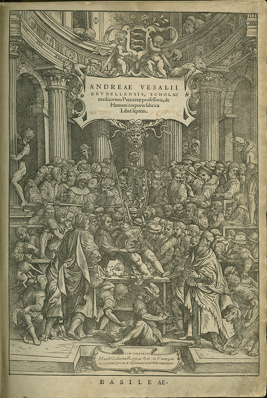
This page features a detailed scene of a densely packed crowd observing a corpse laid out on a table with its stomach open and internal organs exposed. Some figures point or reach toward the body, others look away or are engaged in conversation with one another. A skeleton stands at the head of the table, looking upwards and holding a long pole. At the top of the page, a panel provides information about the author, including his name, the fact that he was from Brussels, and that he was a professor in Padua. It also includes the title of this volume, which in English translates as "On the fabric of the human body in seven books."
This title page counts among the most discussed in the history of the book. Andreas Vesalius, a professor of medicine, took the design of his signature publication, one of the first textbooks of anatomy, into his own hands. He employed a visual artist and sought out one of the best printers for his project, someone with medical and philological training. What is more, Vesalius traveled from Italy to Switzerland to oversee the printing process himself, with particular attention to the use of materials and illustrations.
Not surprisingly, this title page is supercharged with meaning. At the center one detects Vesalius gesturing at the dissected body of a naked woman spread out on a table. He is surrounded by numerous onlookers—people from different walks of life—scholarly authorities from the past and the present, as well as animals. Animals had been used in dissection since antiquity; as an innovator, Vesalius compared their anatomy to that of humans. In what is a tumultuous scene in a theater-like space, the author and anatomist, Andreas Vesalius, with his assured and hands-on, expert approach, seems to triumph.
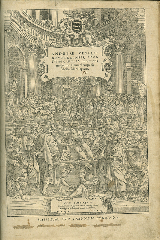
The title page of this volume is similar to the one described above, but not identical. The author is the same, but he is now described as physician to the Holy Roman Emperor, Charles V. Small changes to the imagery include the addition of a goat in the bottom left and alterations to the figure holding onto a column on the left edge of the scene, who is now younger and dressed in contemporary clothing.
The author’s revised and improved edition of his The Fabric of the Human Body, published again with Oporinus in Basel, varies from the first, as is evident from the title page. The reasons for the subtle changes to the new title page are unknown. The differences are all the more puzzling, since the original plate still existed at the time.
Arguably, the most marked difference is that the pole of the skeleton in the back now is a scythe, a traditional attribute of Death. In addition, the head of the author is enlarged. This and other changes emphasize the carnivalesque and tense atmosphere of the scene we get to see.
Compare the two titles' images like a "spot the difference" puzzle.
Beginnings
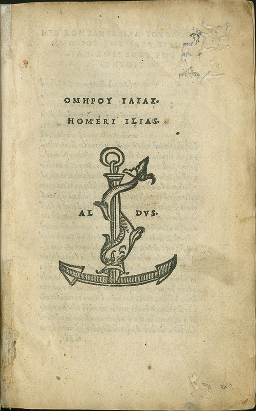
Imagery Upfront

!["Colophon." [Brut, Chronicles of England] ms. [15th c.] Mich. Ms. 225](https://apps.lib.umich.edu/online-exhibits/files/fullsize/228413333d43dd8a1cb298ccff8c2157.jpg)
